Sunday, July 20, 2014

TAG


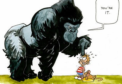
There are ways to make a character memorable to the reader. Now, some will tell you to limit the number of characters to avoid having the reader become lost, but I have yet to figure out how to manage that when writing about the crew of a pirate ship representing many nationalities. The problem is how does a writer re-introduce a particular character several chapters after the initial entry? A useful device is a tag.

Tags are integral in the computing world to quickly find bits of information salted away in a gigantic reservoir of data. Some characters may appear only a few times, but the most minor characters need something to make them memorable as they come and go. Using a tag or two is a way to quickly identify a them to the reader.

Tags may be drawn from any aspect of the character’s appearance or behavior such as:

Voice – The pirate, Hogshead Shaver, has a voice like a heavy log drawn across gravel and a limp from an old wound, the pain causing him to be perpetually cranky. When he appears it is not always necessary to identify him by name. “As François stood glaring at the stowaways, he heard a heavy thump of someone climbing the stairs behind him.” Without saying any more, the reader will think, “Oh, oh, here comes trouble.”

Physical Features – Seaman Warden has a weasel face with an Adam’s apple that moves up and down especially when nervous. Several chapters later, “ François stared at Warden whose Adam’s apple twitched as he attempted to formulate a lie.” The reader will automatically say, “Oh, yeah. Weasel face.”

Physical Abilities – Jeremiah is a mid-teen on his first, real sea voyage. He knows nothing about a ship, referring to the bowsprit as “That pointy thing on the front of the boat.” He is faithful, and willing, and proves that his blue eyes are extra keen which allows him to spend time aloft in the crow's nest. As he says, “It doesn’t smell like below decks.” He also has a cast iron stomach to handle the ship's motion.

Dialect or Speech Mannerisms – English soldier, Lt. Harmond, has all the makings of someone Maggie, a woman pirate, would seriously consider sharing a bed with until he opens his mouth and in a snooty, childish-pitch, says, “Humph,” a sound he uses frequently. Toward the end of the story he is not identified by name, but by the use of “Humph,” when speaking, first when among the English conspirators and just before meeting an untimely and unpleasant demise the reader will know who got his just reward.

Hair – Cochran is a blond Irishman with a freckled complexion susceptible to sunburn and wears more clothes than most of the crew, so few are aware of the nasty scar on his left shoulder. He is jovial sort and an inveterate story teller through which he teaches valuable lessons.

Gestures – Seaman Stag swipes his constantly running nose.

Scent – Seaman Filbert smells as if he'd been bathing in the bilge despite having been tossed overboard with a bar of soap when the ship was becalmed.

There is an endless laundry list of quirks and mannerisms available that can become tags and add reality to your characters, but be careful about using too many for one character and distracting from the main character. Just one or two tags, little mnemonic devices to help our readers keep the actors straight as they pop in and out.

A great place to find ideas is of course, the movies, specifically looking at the body of work of some of great character actors such as:


                     Christopher Lloyd
                            and                                          

                                                                   Johnny Depp


NOTE: This eFile normally appears on the 1st and 15th of the month (or reasonably close), however until mid-September don't be surprised if it is late as much of my writing time is being taken by getting our new home ready to occupy.


Tuesday, July 1, 2014

To Format or Not to Format, That is the Danger


The early days of my youth were spent on my uncle's farm and then later helping a neighbor with his wheat fields. Despite how it appears, it's not easy growing that stuff you eventually smear peanut butter and jelly on in the morning and call it breakfast. Writing has not been easy, either. In the “old” days, to become published you had to entice an agent and then a publisher. Today it's worse. In 2012, R.R. Bowker (the official US ISBN distributor) counted more than 391,000 self-published titles. The most common complaint heard is that most of what's out there is . . . well, to be polite, not so good. Anyone can publish and obviously Anyone is.


Separating the wheat from the chaff, the good from the trash is tough.


As an author, editor, and publisher sifting is something I face every day. Some people can not put a sentence together let alone two. There are those who can actually spin a good tale, but do it their way and ignore accepted format. As one writer responded to an editorial suggestion, “I LIKE to use italics for "thoughts," and I think readers do as well. So I will continue to do so.”

The stark truth is, if you want to sell your labors to a reputable publisher AND keep an audience, you need to play the game.

If you are bent on approaching an agent or publisher, find out in what format they want to see your material displayed. That is generally one-inch borders all around, double spaced, but there could be slight variances. Digital submissions have their own rules. Know them. Follow them. As example, here is what one major publisher wants:

"Manuscripts should be formatted as follows:
Double-spaced, 12 pt. font with one-inch margins.
Indented first lines without extra returns between paragraphs.
"
(Although not noted, do not use exotic fonts. Stick to the basic serifs like Times New Roman, Droid, Bookman, Helvetica, or their clones.)

With that said, it is important to acceptably format what goes inside. Before the early 1900's it was a free-for-all and confusing as all get out until one publisher took Cooley's Bull by the horns and lead out for consistency. Thus was born . . .
The Chicago Manual of Style

The history of The Chicago Manual of Style spans more than one hundred years, beginning in 1891 when the University of Chicago Press first opened its doors. At that time, the Press had its own composing room with experienced typesetters who were required to set complex scientific material as well as work in such then-exotic fonts as Hebrew and Ethiopic. Professors brought their handwritten manuscripts directly to the compositors, who did their best to decipher them. The compositors then passed the proofs to the “brainery”—the proofreaders who corrected typographical errors and edited for stylistic inconsistencies. To bring a common set of rules to the process, the composing room staff drew up a style sheet, which was then passed on to the university community called The University Press Style Book and Style Sheet.

That sheet grew into a pamphlet, and by 1906 the pamphlet expanded into a book, Manual of Style: Being a compilation of the typographical rules in force at the University of Chicago Press, to which are appended specimens of type in use—otherwise known as the 1st edition of the Manual. [They loved long titles back then – ed.] At 200 pages, the original Manual cost 50-cents, plus 6-cents for postage and handling.

Now, in its 16th edition, The Chicago Manual of Style—at more than a thousand pages or more than two thousand hyperlinked paragraphs online—has become the authoritative reference work for authors, editors, proofreaders, indexers, copywriters, designers, and publishers. This hundred-plus-year evolution has taken place under the ongoing stewardship of Chicago’s renowned editorial staff, aided by suggestions and requests from the Manual’s many readers. (University of Chicago Press.)

(See: http://www.chicagomanualofstyle.org/about16_history.html

With very few exceptions, this is the format that publishers of non-fiction and fiction follow. There are other formats adopted by other professions, but if you want to be a published author of fiction, this is your tool.

Do all publishers follow this guide? No. Case in point. This past year a major, western U.S. publisher distributed an eBook. The title page was a train wreck, and it went down hill from there. Later, they published a page-turner, with “creative” formatting and some of the poorest editing in recent memory. Their audience complained and book sales slumped. While most readers are not consciously aware of formatting, they recognize a Golden Retriever from a duck.

Over the years, I have written articles for newspapers, scientific journals, law journals, and novels. Each has their own way of presenting material, and their respective editors expect to see submissions in that format. Considering the huge amount of material passing over their desk, it makes life a lot easier and happy for them. When an editor is happy, I am happy, and my bank account is happy.

While the Chicago Manual is the accepted guide for novels, it is not stringent. If, like the writer above with the italics issue, you want to slide a bit off the path to present something different, nothing says you can't. As the Chicago Manual board will say—just be consistent, however understand you are taking chances with acceptance, and if an agent or publisher wants it changed, be polite and compliant unless the request they are sending you off to third base before going to first, then be suspicious.


(A note: The Elements of Style by William Strunk Jr. and E.B. White deals primarily with language, and certainly worth a look.)